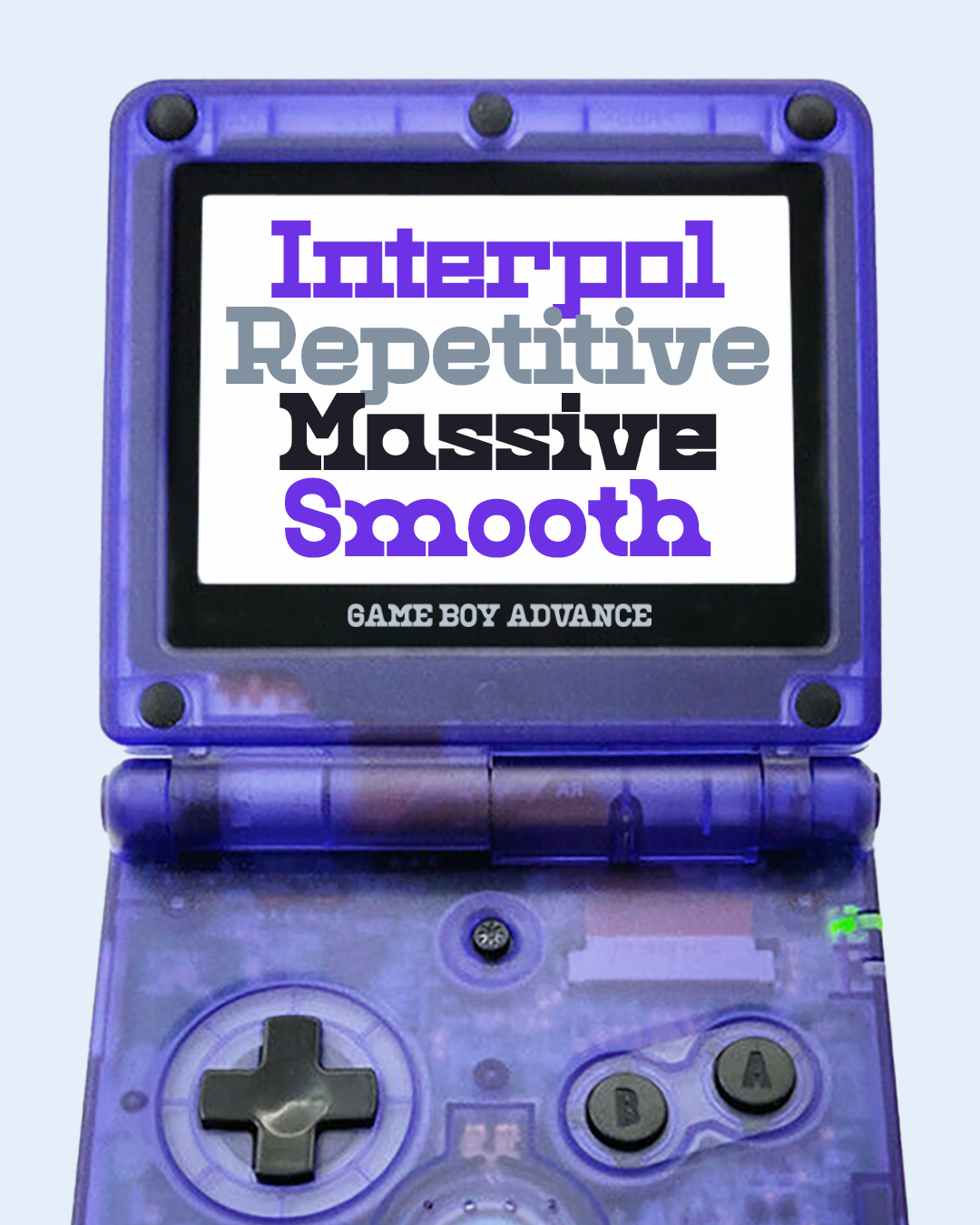
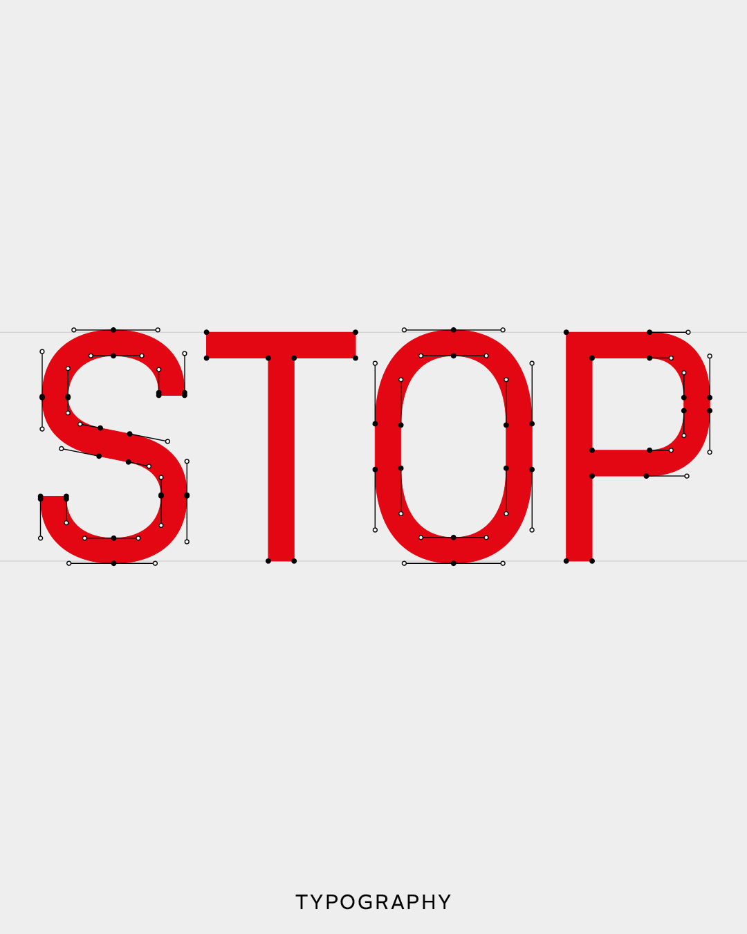
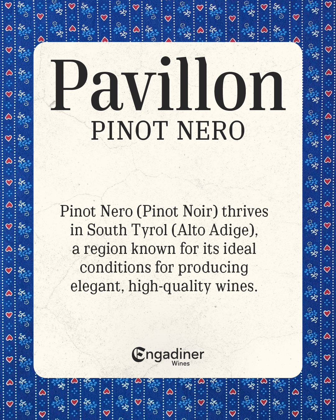
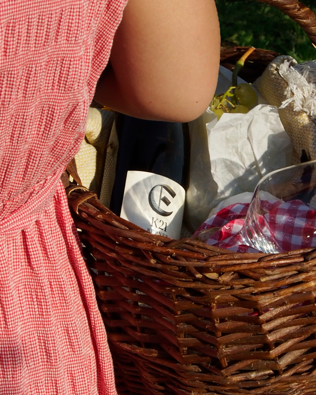
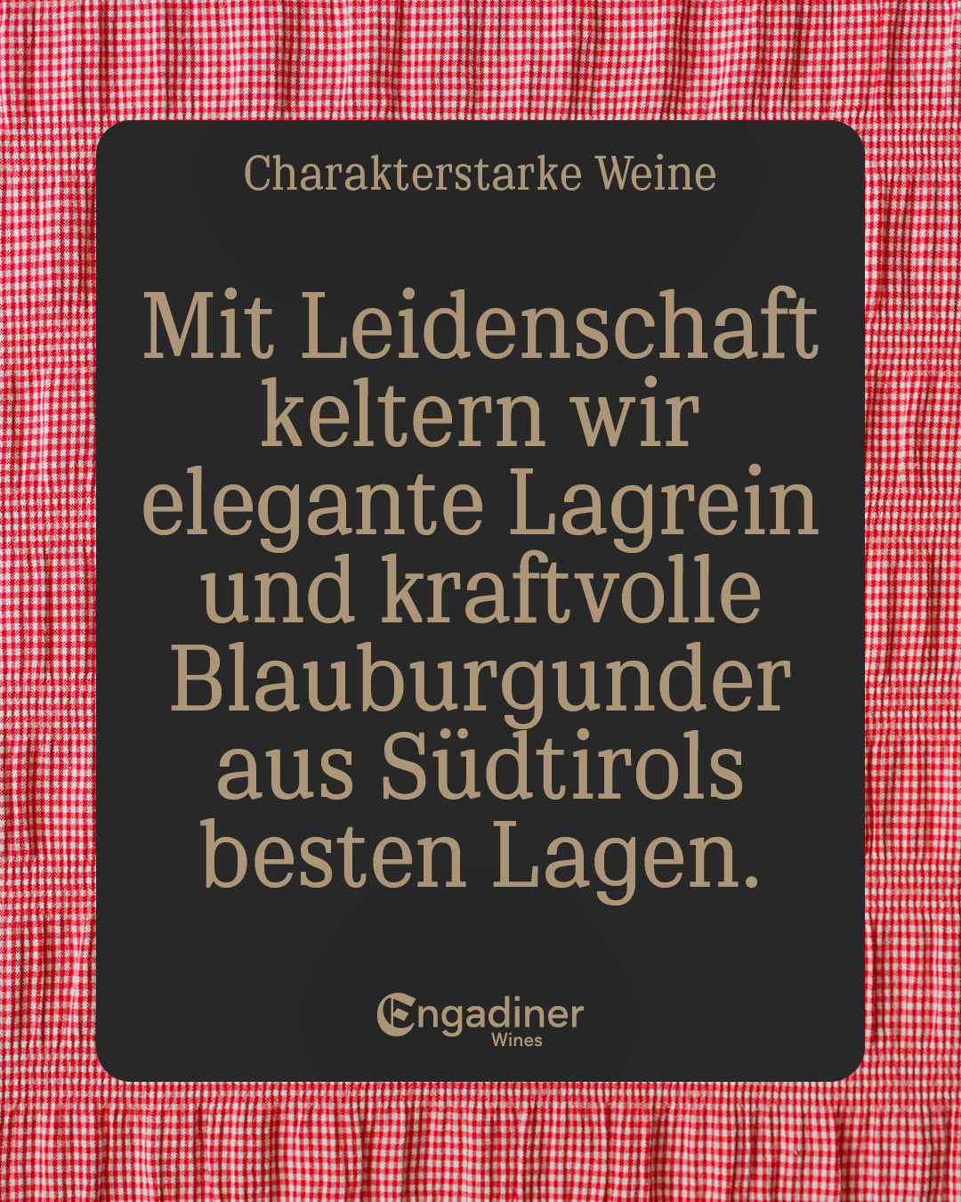
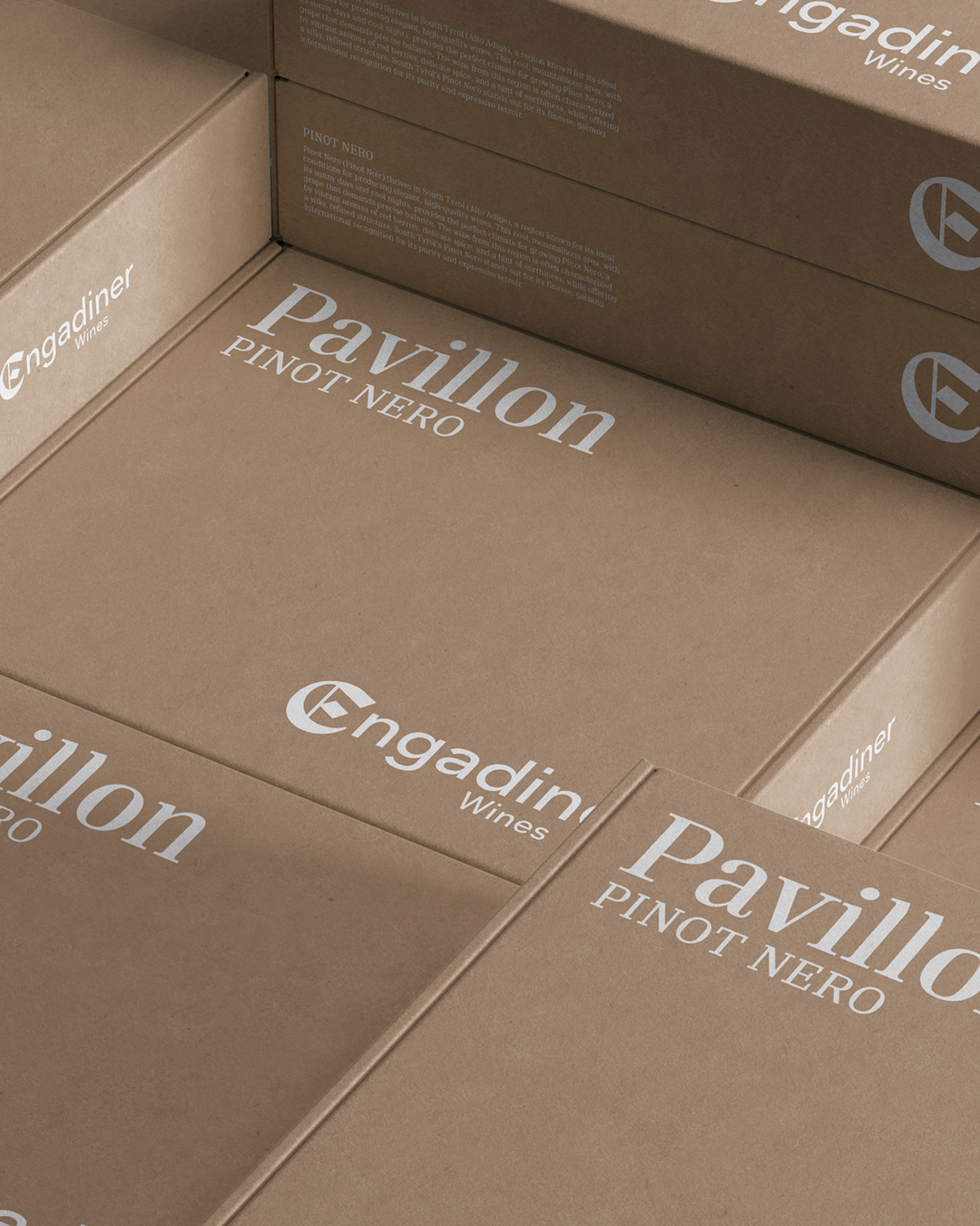
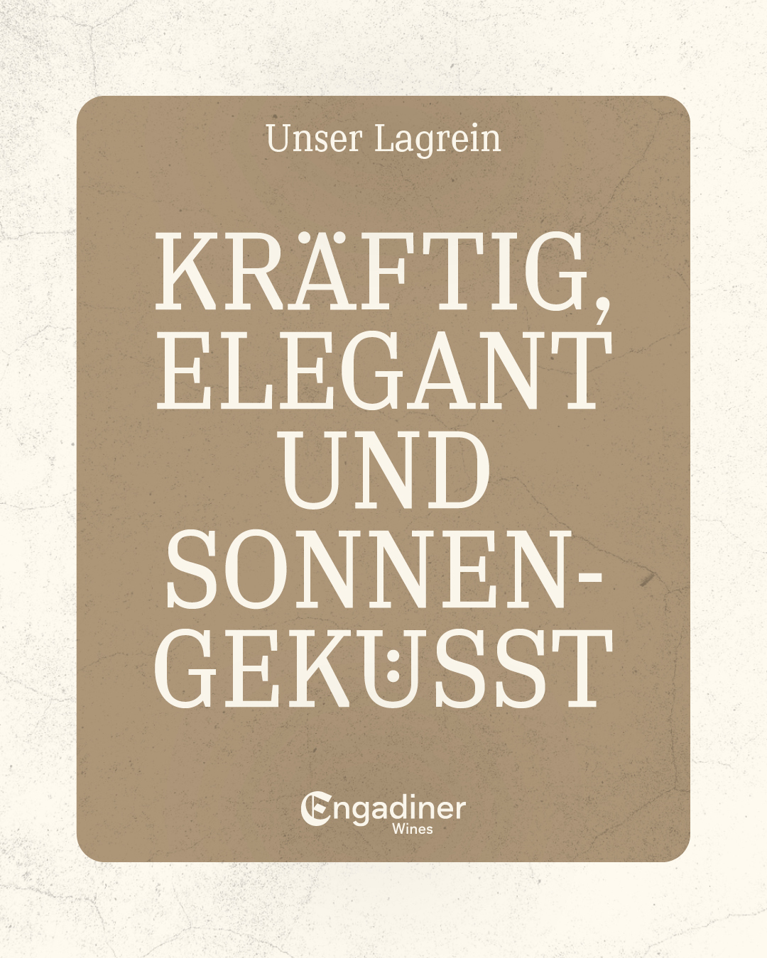
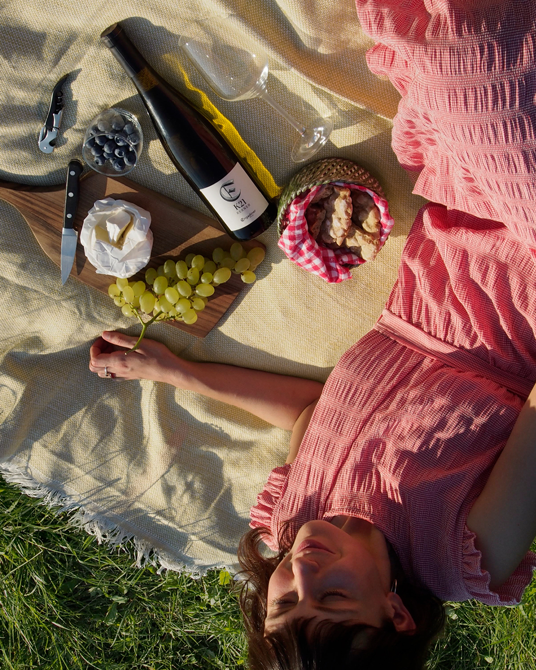
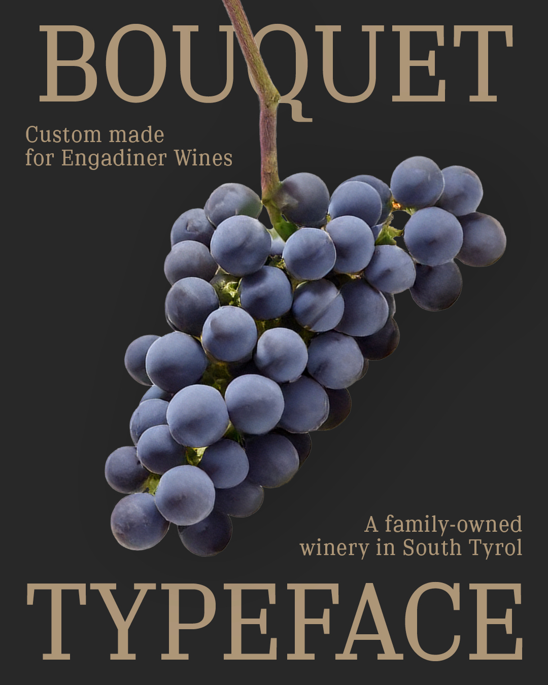
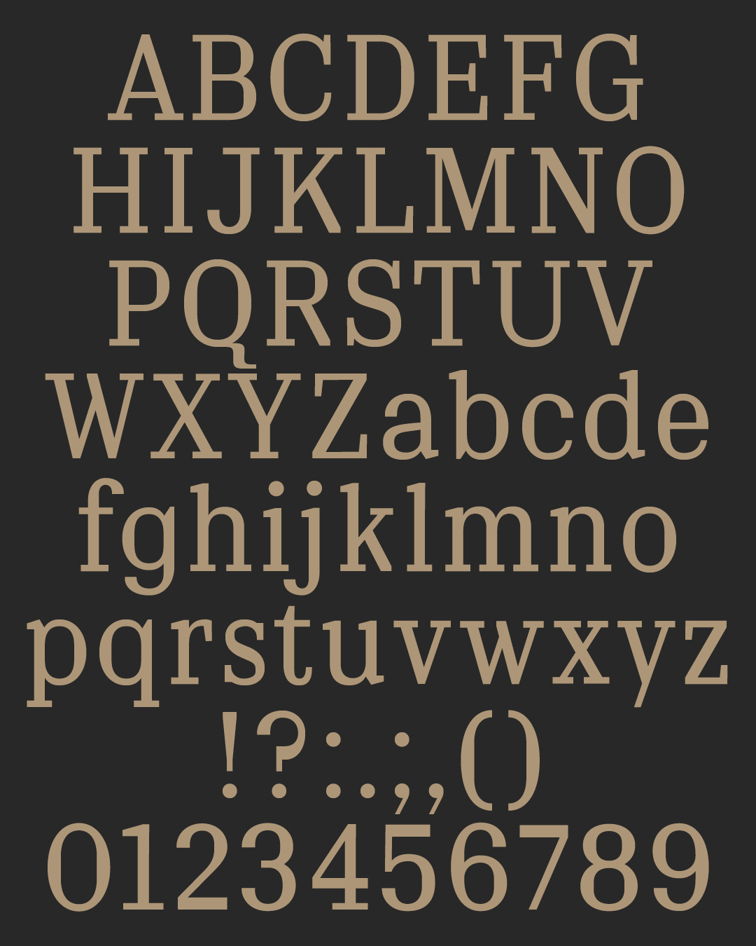
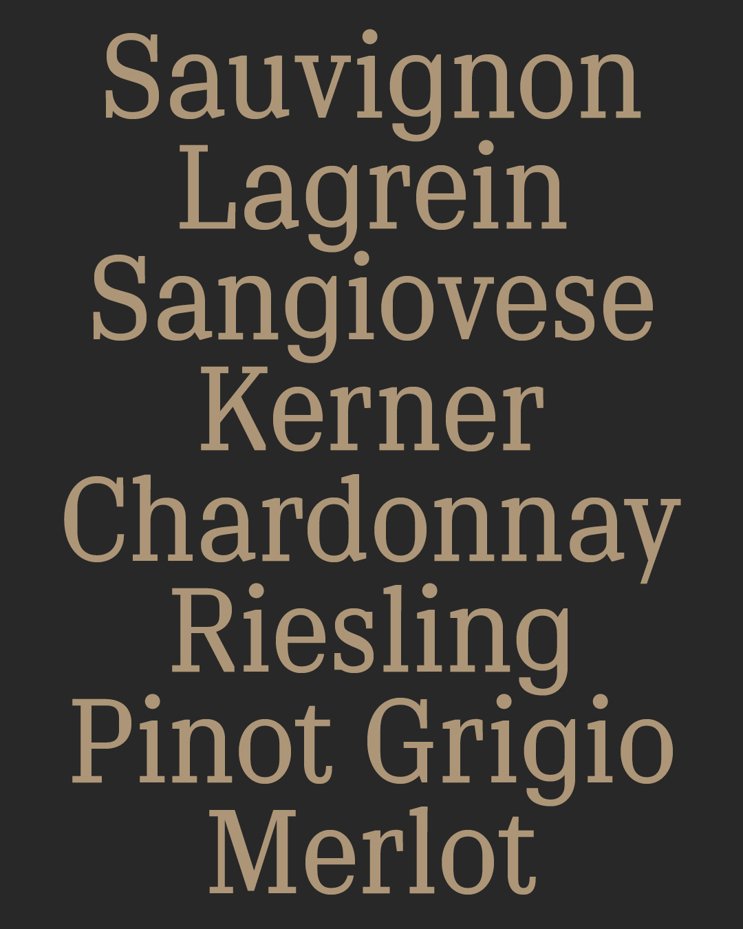
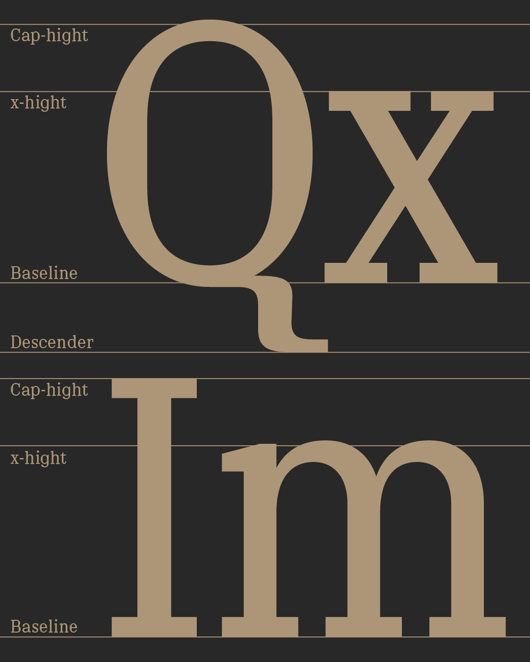
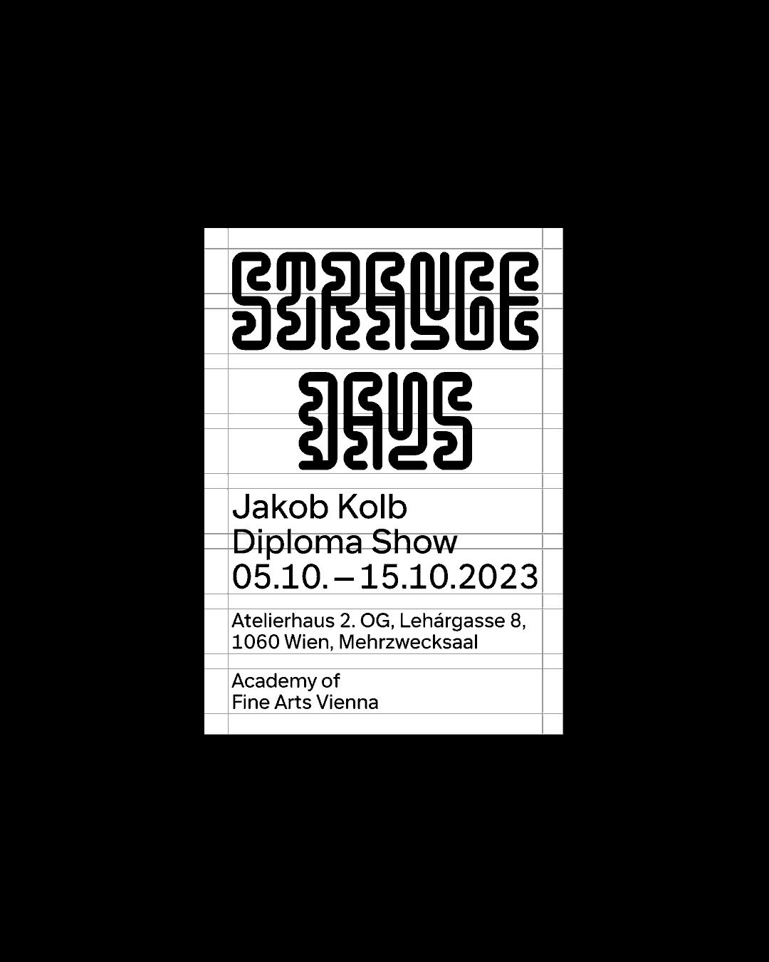
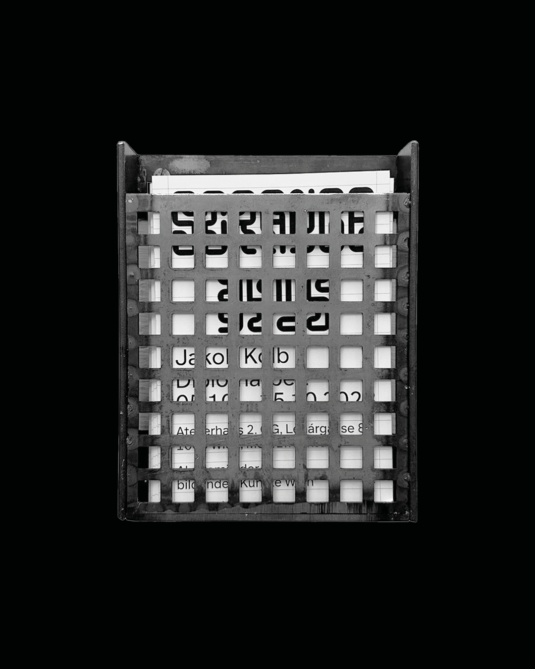
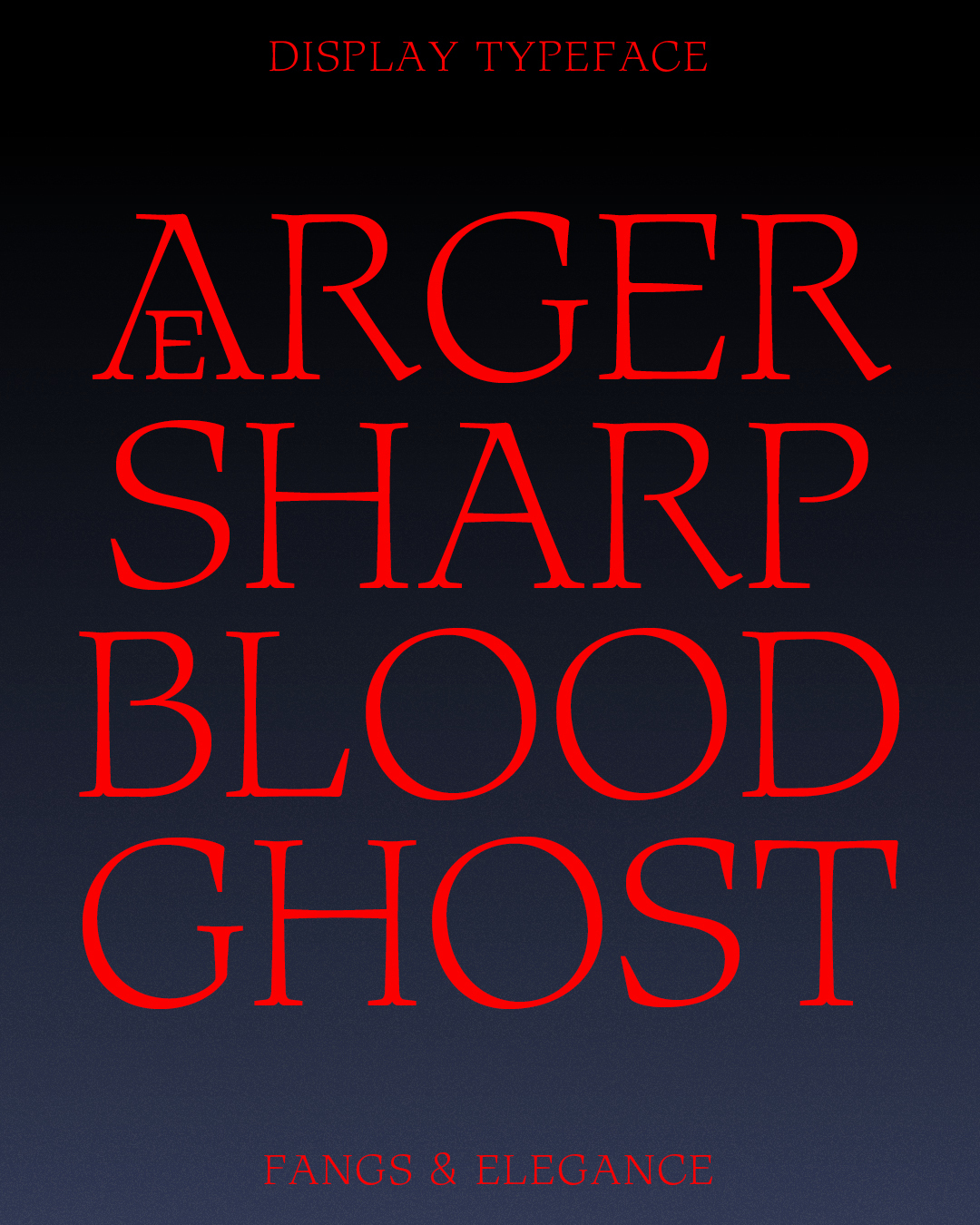
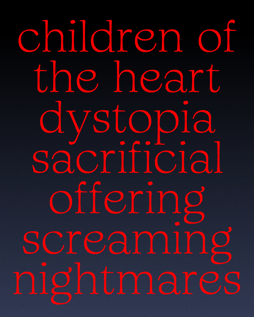
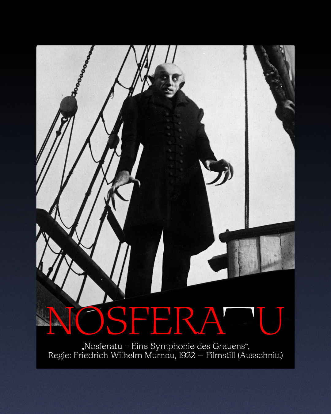
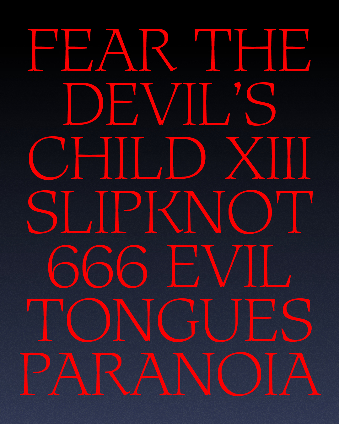
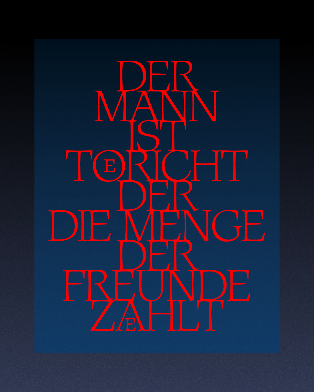
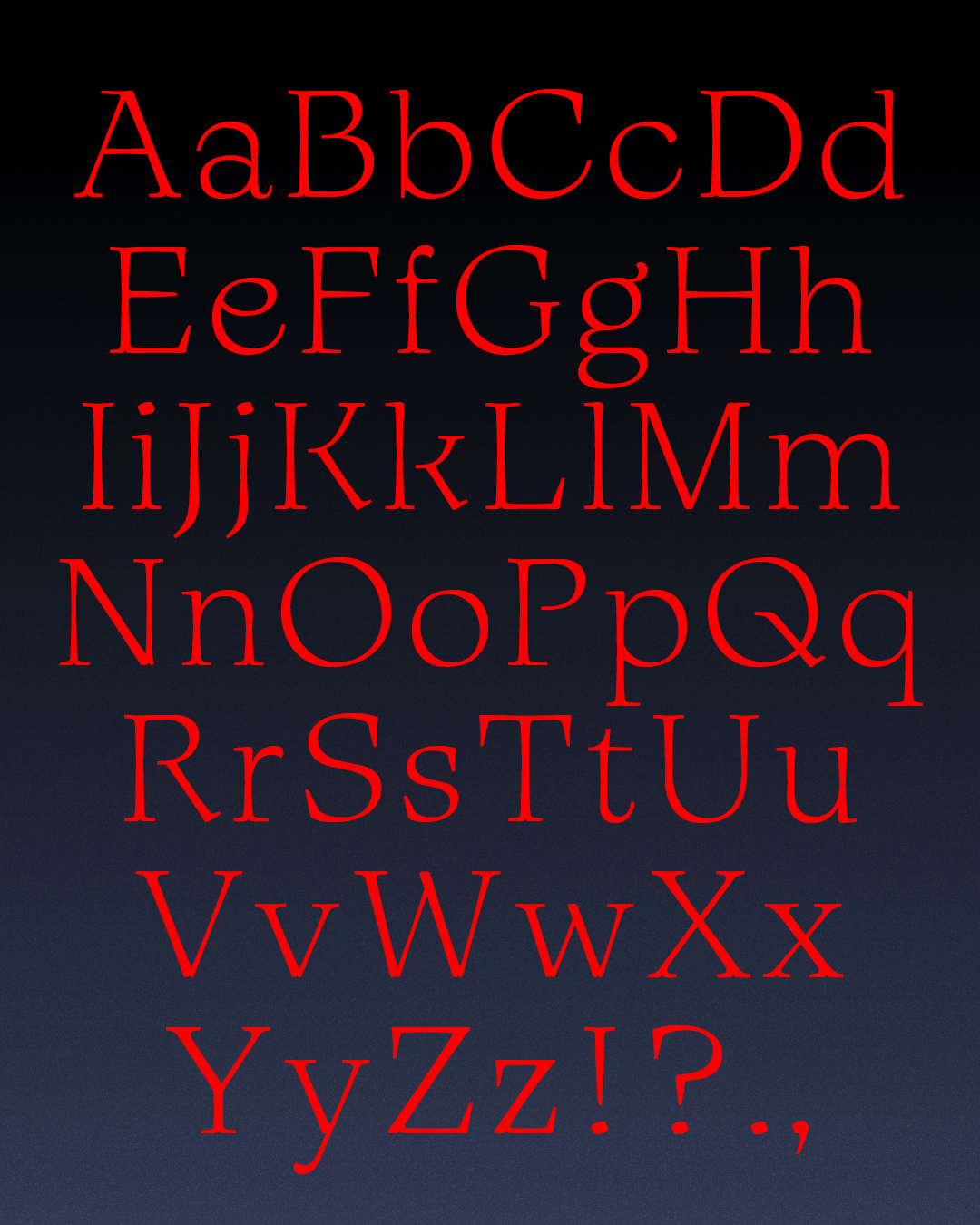
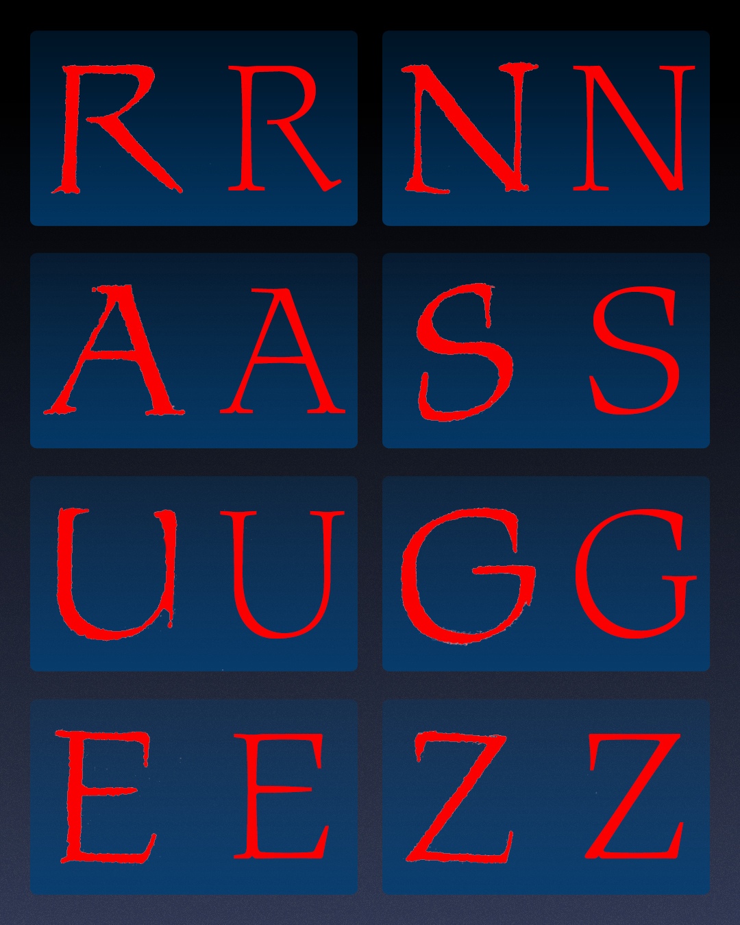
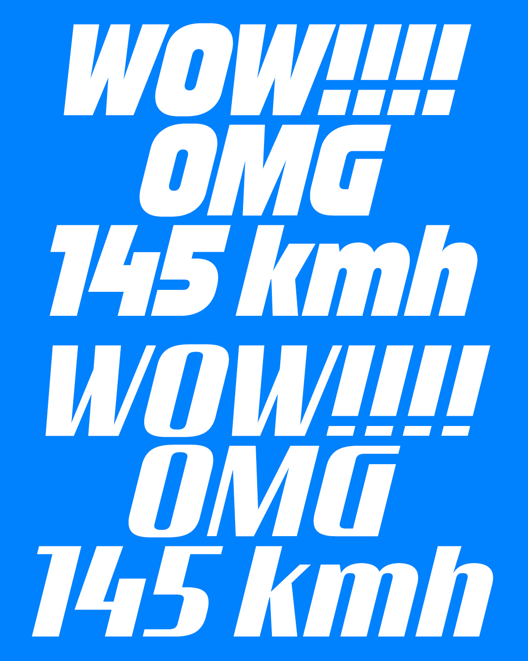
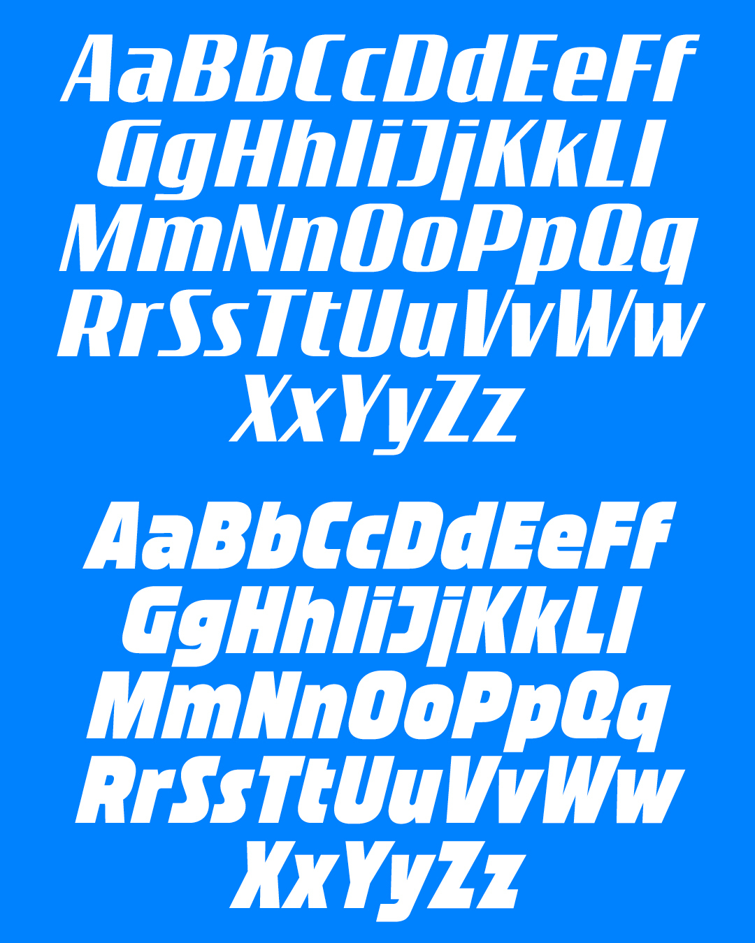
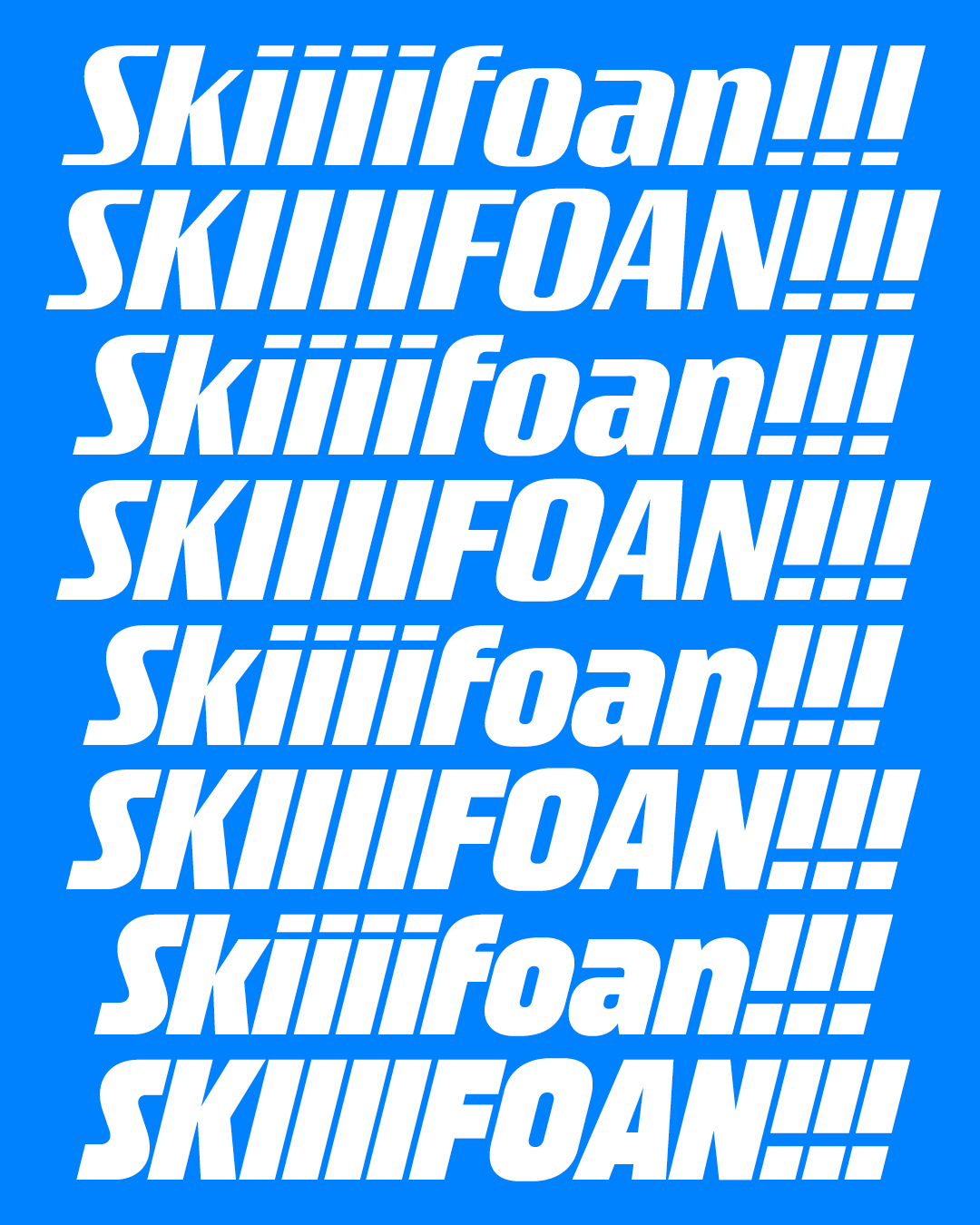
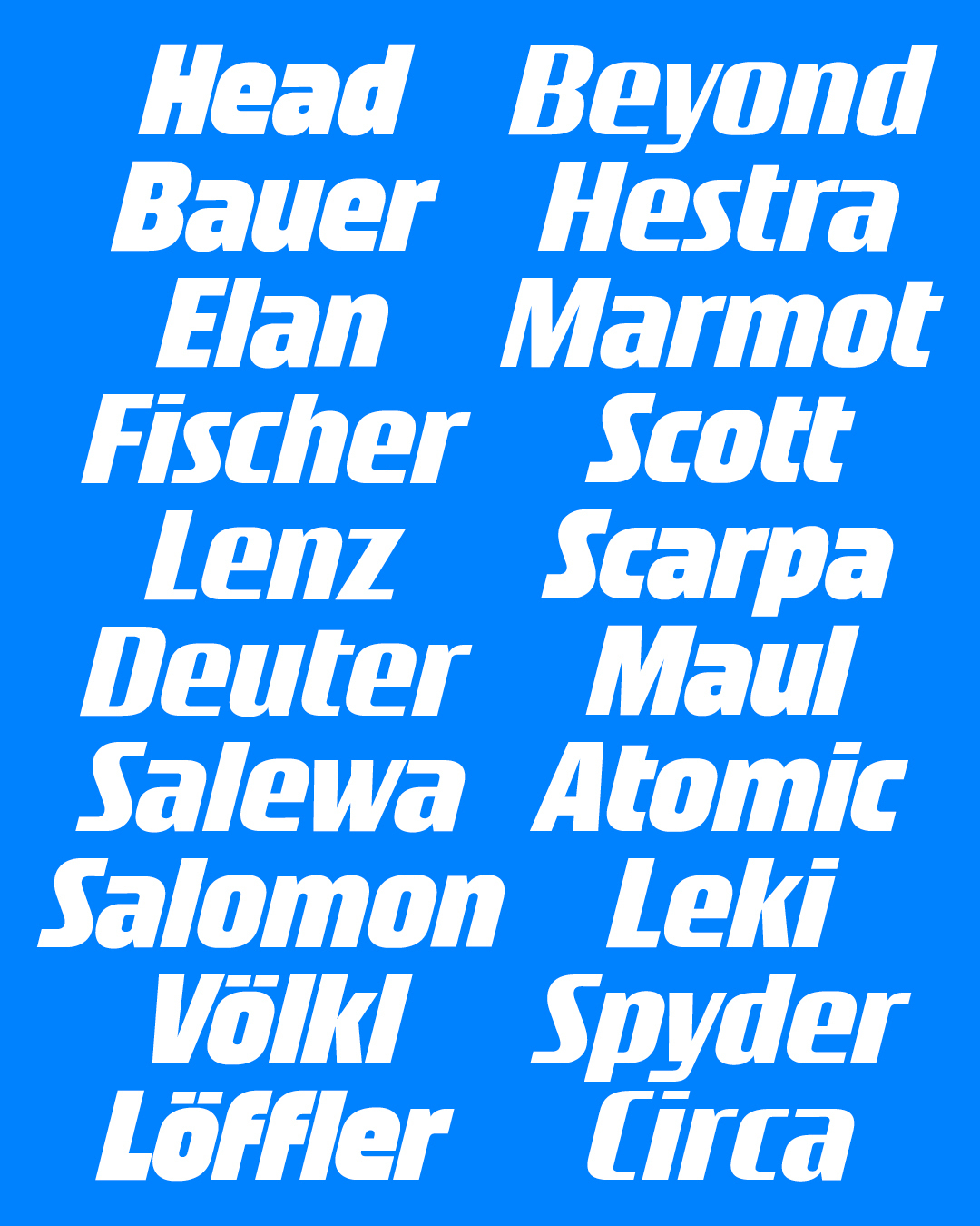
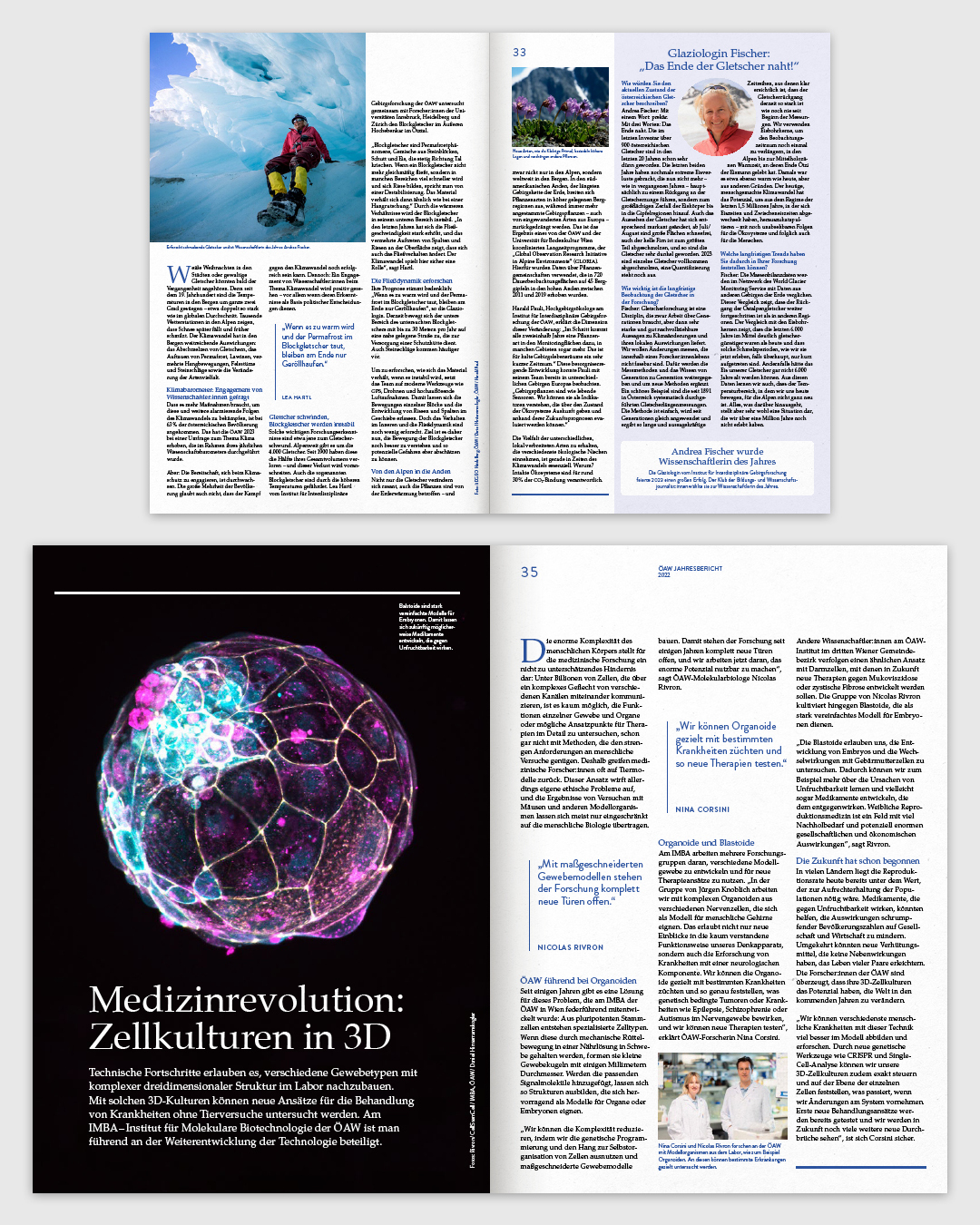
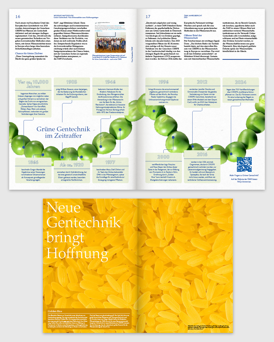
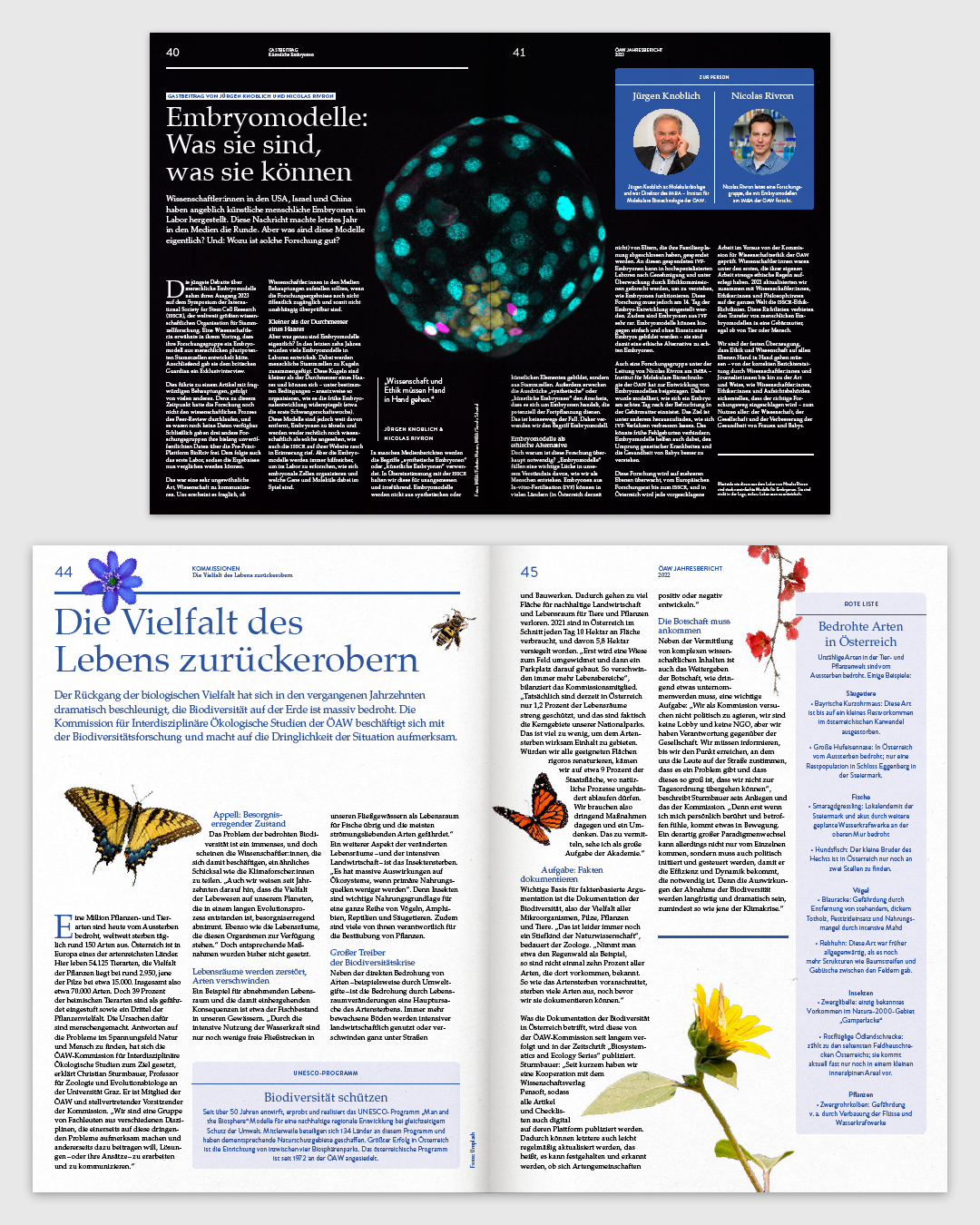
Hello, my name is Franz Tiefenthaler. I'm an information, graphic, and type designer specializing in corporate identity, editorial design, and typography. I'm passionate about creating clear, distinctive, and purpose-driven designs combined with strategic solutions that deliver real impact and help my clients stand out in their market.

Work

Departments:

Concept

Graphic

Typography

Ski Time Test

The goal of the redesign was to modernize the brand identity of a small, family-owned company specializing in compact timers for ski racing. Balancing their reputation as an engineering-driven, self-sufficient team with a futuristic yet nostalgic aesthetic, the rebrand reflects their unique values and market niche. A custom typeface and corporate design system were created to embody the fusion of traditional craftsmanship and forward-thinking innovation. The logo is inspired by a clock face and a snowflake, symbolizing the core elements of ski racing. This cohesive design establishes a compelling visual identity that honors the company’s legacy while positioning it for future growth.

Client
Involvement
Concept, Graphic, Typography
1/5
INFO

Kompakt Typeface

The Kompakt typeface conveys speed, boldness, and modernism, all while maintaining compactness and versatility. It maximizes space efficiency without sacrificing style or legibility. Through its variable contrasts, Kompakt delivers clear readability at all sizes and reliably performs in diverse applications.

Client
Involement
Concept, Typography

SCOPE
PROGRESS (1-5)
Latin Extd-A Glyphset

Contrast – Stroke Weight

Thin-Bold
1/6
INFO

ORF Public Value Report 2022

This project involved designing the yearly publication for the ORF to present internal data, highlighting its contributions to diversity and society through reporting and broadcasts. The goal was to create a visually engaging yet professional format that emphasizes the trustworthiness and significance of the data. The inner layout was designed with a focus on modesty and clarity, mirroring the precision of the numbers it presents. The brick on the cover represents numbers as solid, reliable entities, echoing the ORF logo’s rectangular shape, often humorously called the "ORF-Brick." This motif extends into the interior, where it appears in information graphics, creating a cohesive visual language throughout the publication.

Involvement
Concept, Graphic
1/7
INFO

Interpol Typeface

Interpol is a variable font with a grid-based system. Its design principle explores different degrees of edge rounding, creating letterforms that oscillate between rigidity and softness. This variability reveals the gradual emergence of something concrete from something abstract, making the design process visible. This contrast gives Interpol a dynamic visual character, making it ideal for striking headlines, futuristic designs, and expressive typographic compositions.

Involvement
Concept, Typography

SCOPE
PROGRESS (1-5)
Latin Extd-A Glyphset
1/7
INFO

Leica Photocatalouge Redesign 2022

The goal of this project was to design a layout that highlights the images, while keeping the accompanying text informative but unobtrusive. A flexible grid system was developed, allowing elements and images to be arranged dynamically. This adaptability ensures that the layout fits each shape and format of photograph, offering a visually engaging yet uncluttered presentation. Text elements were purposefully restrained, avoiding decorative styles to maintain a clean and minimal aesthetic that supports the images without distracting from them. The design takes inspiration from sympathy cards, channeling their understated elegance and quiet respect. This approach brings a sense of reverence to the photographs, underlining their importance and creating a contemplative experience for the viewer.

Involvement
Concept, Graphic
1/6
INFO

Walze Typeface

Walze is a sans serif typeface with four style sets, all based on a shared structure blending grotesque and gothic elements. Each style features unique glyph terminals: Set 1 emphasizes a Gothic character, Set 2 draws inspiration from Bauhaus, Set 3 adopts a distinct Humanist approach, and Set 4 features a more Grotesque aesthetic. The consistent structure allows for seamless mixing and matching of styles.

Involvement
Concept, Typography
Student Project
Professor

SCOPE
PROGRESS (1-5)
Latin Extd-A Glyphset

OTFs Stylistic Alternates

Thin-Bold
1/9
INFO

Engadiner Wines

The new identity for Engadiner, a family-owned vacation farm and winery in South Tyrol, Italy, successfully marries the company's rich agricultural heritage with its contemporary winemaking endeavors, projecting a brand that values bothtradition and timelessness. The new design was inspired by the original logo, which featured the name "Engadiner Hof" in a fractured typeface. This fractured look was reimagined and modernized. To complement this update, I chose a sans-serif typeface for the rest of the lettering, ensuring a balanced and unified visual identity. The E was further reimagined as a three-dimensional form, resembling a stone carving. This design choice enhances the decorative potential of the logo, allowing it to be used as an emblem. The carved effect symbolizes the craftsmanship and quality that goes into their winemaking process.

Client
Involvement
Concept, Graphic, Typography
1/5
INFO

Bouquet Typeface

Bouquet is a typeface that embodies a company’s commitment to quality, tradition, and craftsmanship. Drawing inspiration from the timeless elegance of classicist Antiqua, the design sought to merge traditional elements with a sense of rugged authenticity. By incorporating slab serifs into the classic structure, the typeface achieves a unique blend of refined tradition and rustic charm. The strong, sturdy serifs evoke a sense of craftsmanship and durability, while maintaining the elegant and readable form of a classic Antiqua. This combination results in a typeface that feels both timeless and grounded, perfect for representing a brand that values its heritage and attention to detail.

Involvement
Concept, Typography
1/5
INFO

Strange Days

I had the privilege of designing an information sheet and posters for the diploma exhibition of my close friend Jakob. Titled “Strange Days,” the exhibition delves into themes of creation, preservation, and the transience of memories. The design was directly inspired by the three sculptures at the heart of the exhibition. These sculptures consist of rigid metal frameworks that interact with organic objects, creating a compelling dialogue between structure and fluidity. Reflecting this dynamic, I developed a layout where the grid itself remained visible, emphasizing the rigidity of the frameworks. In contrast, the typography introduced a flowing, organic quality, mirroring the interplay of structure and transience central to the sculptures and the exhibition as a whole.

Client
Involvment
Concept, Graphic, Typography
Photography
1/6
INFO

Ärger Typeface

Ärger is a serif typeface designed to combine elegance with a sense of ominousness. It was inspired by the hand-drawn letterforms in an old book found in my parents' attic and by the proportions of Capitalis Monumentalis. Origin The project began in 2021 with the digitization of the capital letters found in the book. Some of the characters had subtle indentations on their base serifs—small imperfections that I found appealing and chose to incorporate into every glyph. Building on these initial forms, I refined the typeface, using the rhythm of Capitalis Monumentalis as my primary reference. After completing the uppercase set, I continued developing the typeface by designing the lowercase letters and symbols.

Involvement
Concept, Typography

SCOPE
PROGRESS (1-5)
Latin Extd-A Glyphset

Thin-Bold
1/6
INFO

ÖAW Annual Report 2023

The redesign of the ÖAW Yearly Report focused on creating a layout that combines flexibility with a cohesive visual identity, ensuring that diverse information could be seamlessly integrated while maintaining a professional and polished appearance. The design takes inspiration from the original design language of the ÖAW, preserving key elements such as the blue color palette, typefaces, and the distinctive style of the logo. Special attention was given to the use of integrated lines, which appear consistently at the top of the page to introduce text and at the bottom to signify its conclusion, creating a structured and recognizable visual rhythm.

Client
Involvement
Concept, Graphic
1/6
INFO

Brachial Typeface

Brachial is a modular display typeface inspired by traditional Fraktur letterforms. Constructed from vertical and diagonal strokes, its structure is raw and geometric. Designed as a variable font with a single axis, it transforms from ultra-narrow to ultra-wide by extending its diagonals and compressing its verticals, or vice versa.

Involvement
Concept, Typography

SCOPE
PROGRESS (1-5)
Latin Extd-A Glyphset
Narrow-Wide
1/8
INFO

FWF Iconset

As part of the new FWF identity, a set of icons was developed to complement and align with the updated visual language. The design process centered around integrating the distinctive angle and stylistic features of the new logo into the icon set. The angle of the logo influenced not only the overall forms but also the way lines intersect, how corners are shaped, and how line endings are executed. This consistent approach creates a cohesive visual system that ties the icons seamlessly to the broader identity. The resulting icon set balances clarity and sophistication, offering a visually unified and easily recognizable representation of the FWF brand across various applications.

Client
Involvement
Graphic
1/4
INFO

E stands for Empire

During my studies at the New Design University in St. Pölten, Austria, I attended the Carftstudio course. During the course, I designed this letter under the guidance of Hermann Seiser. The work began with the design of the letter, for which I was inspired by knife shapes. The construction of the letter began with the casting of the plaster block, which I then gave a rough shape with a saw and then worked in the details with the help of a file.

Involvement
Concept, Typography
Student Project
Professor
1/2
INFO

Reposition Magazine

A magazine that provides a platform for presenting research work, sharing work-in-progress insights, and fostering constructive criticism. The publication encourages interaction and dialogue, creating an open space for collaboration and exchange of ideas. The concept of "in-between"—the interaction and connection between people, ideas, and processes—inspired the magazine’s design language. This is reflected in how spaces are treated throughout the publication. The space between columns of text is intentionally disrupted, creating unconventional layouts that invite exploration. Design elements occupy unusual places, breaking traditional boundaries and encouraging the reader to view the content from fresh perspectives.

Involvement
Concept, Graphic
1/7
INFO

Studio

Concept Department

The Concept Department is a trusted resource for developing ideas from the ground up or adjusting existing concepts to new applications, ensuring a thoughtful and cohesive approach. This package offers expertise in creating concepts for a wide range of products, including comprehensive corporate identities and designs, as well as individual projects such as editorial layouts, infographics, websites, merchandise, wayfinding systems, and festival or food and beverage branding. Departments can be booked individually or together, depending on your specific needs.

COMBINATION OPTIONS
INCLUDES
Concept Department
Development of a concept
Concept + Graphic Department
Concept + cohesive graphics
Concept + Type Department
Concept + cohesive typography
All Departments
All-inclusive package
INFO

Graphic Department

The Graphic Department’s services focus on extending brand identity to new products. Whether adapting your concept to new applications or bringing a fully realized idea to life, precision and creativity are applied in every project. Offerings include editorial layouts, infographics, websites, corporate identities, merchandise, wayfinding systems, and packaging, all while ensuring a cohesive look across every element.

COMBINATION OPTIONS
INCLUDES
Graphic Department
Development of graphics
Graphic + Type Department
Graphics + cohesive typography
Graphic + Concept Department
Graphics + concept development
All Departments
All-inclusive package
INFO

Typography Department

The Typography Department specializes in elevating your brand identity through custom typography. Whether transforming your concept into a typographic design or realizing an idea, every project is executed with attention to detail and creativity. Services include custom typefaces, lettering, wordmarks, icons, and decorative type elements, ensuring a cohesive and consistent visual identity across all applications.

COMBINATION OPTIONS
INCLUDES
Type Department
Development of a typeface
Type + Graphic Department
Typeface + cohesive graphics
Type + Concept Department
Typeface + concept development
All Departments
All-inclusive package
INFO
Franz Tiefenthaler